ART DIRECTION
I worked with producers, writers, Netflix, and a team of artists to develop a look for Chicago Party Aunt that matches the fun and energy of its protagonist, Diane. The overall vision for the show was to create a recognizable version of Chicago and its inhabitants that emphasized fun and liveliness. In all aspects of design we aimed to be as energetic, freewheeling, colorful and big hearted as Diane.
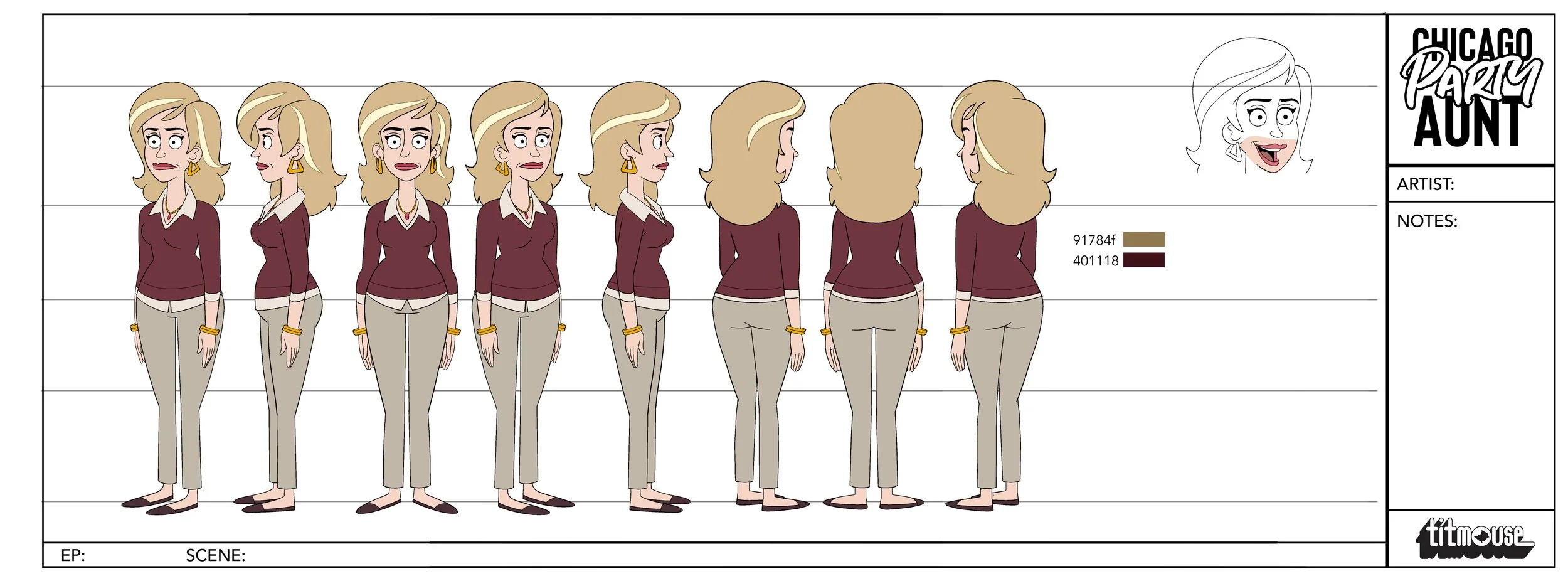
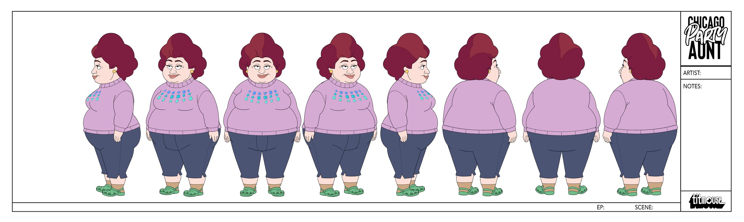
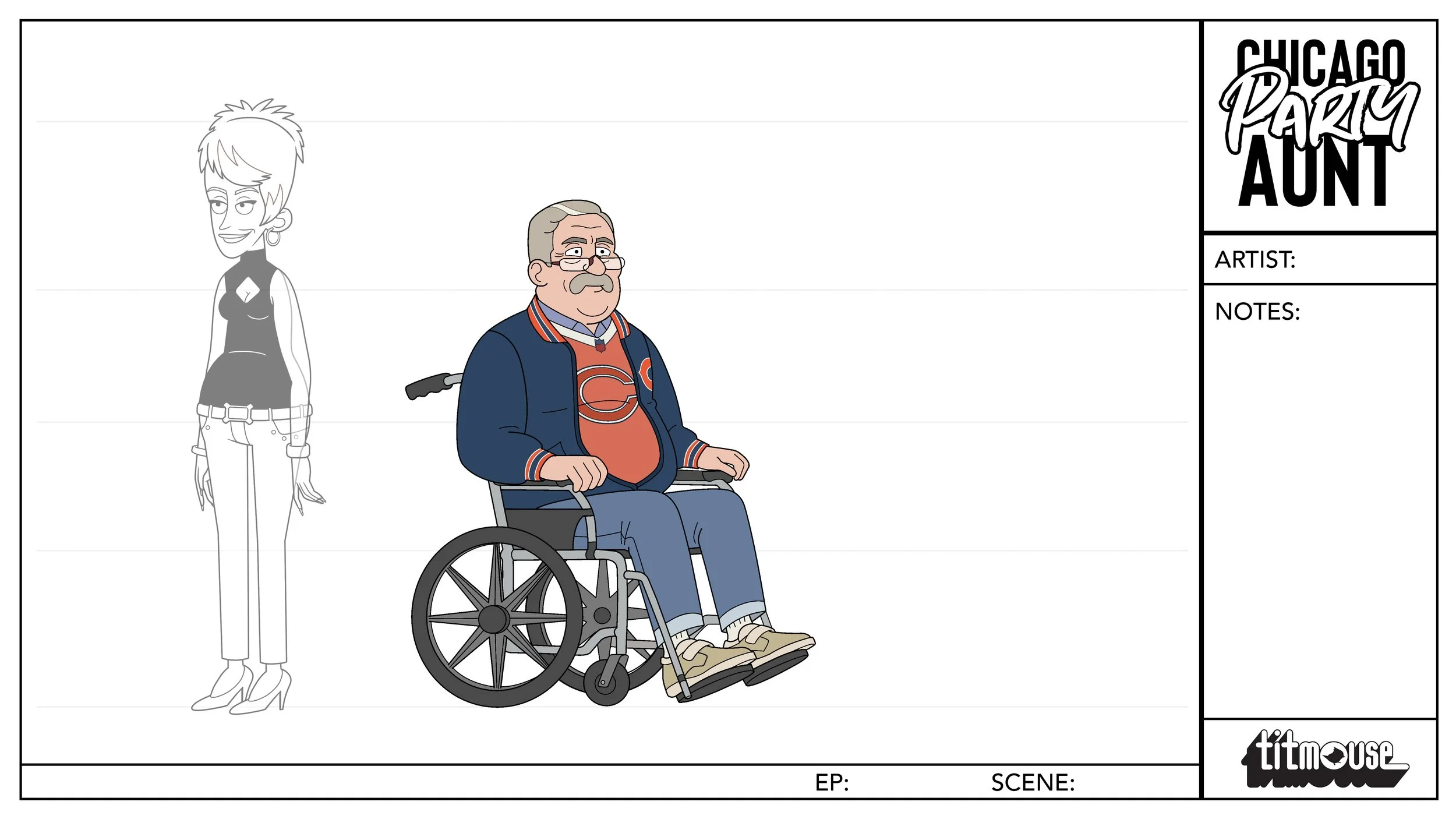
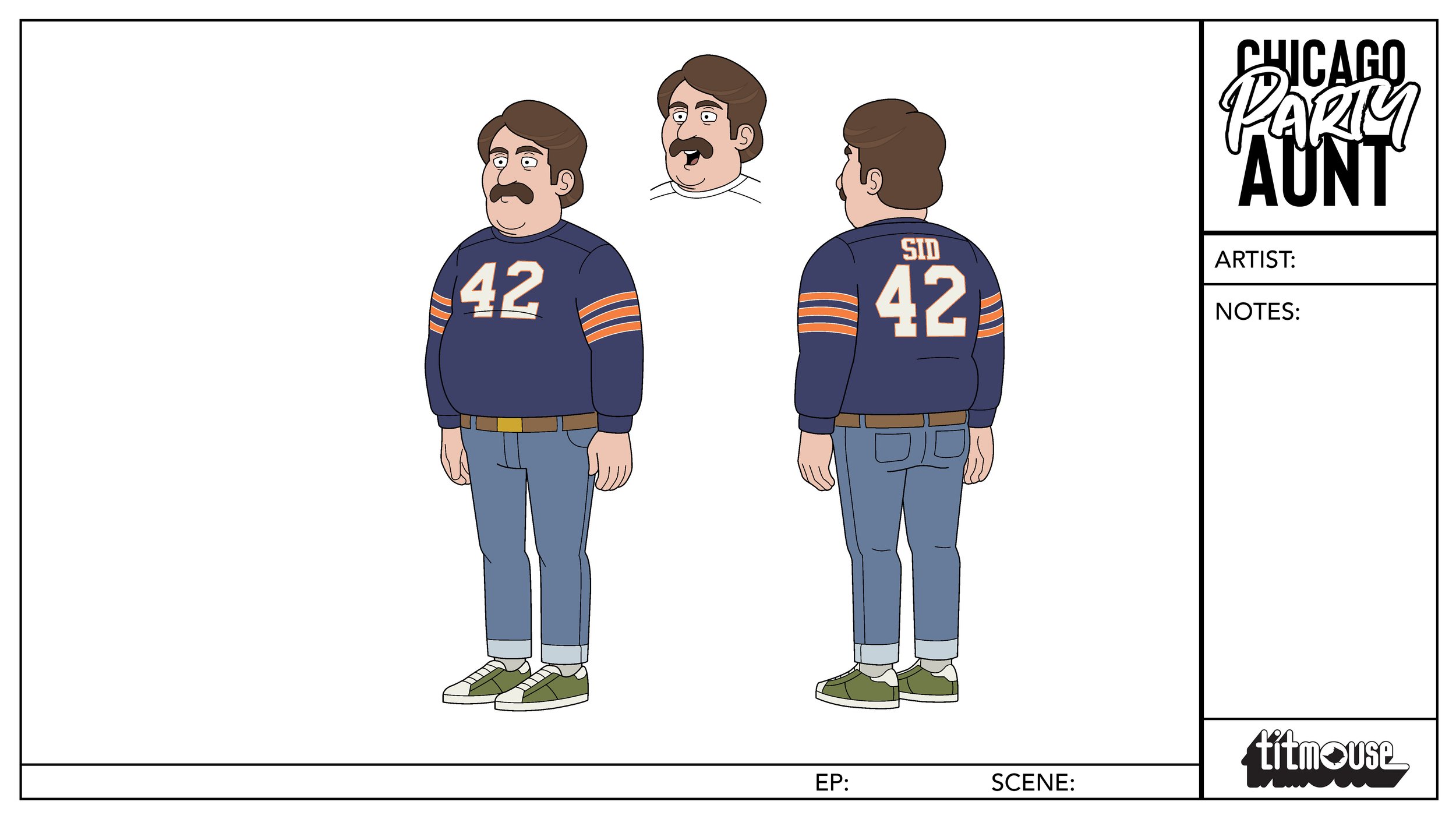
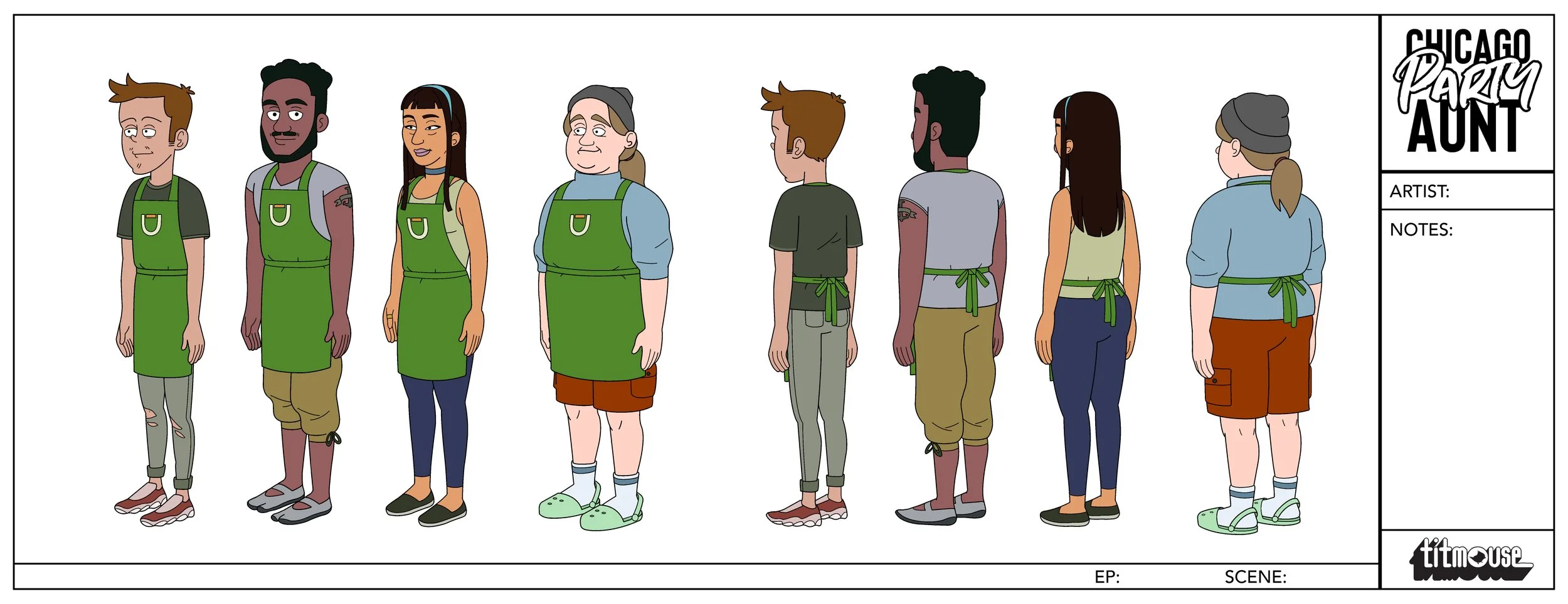
Character Design
I guided the character design team to arrive at the final designs for the show. Our goal in populating the world of CPA was to keep characters rooted in simple 3D forms and explore a variety of interesting shapes while staying relatively grounded.


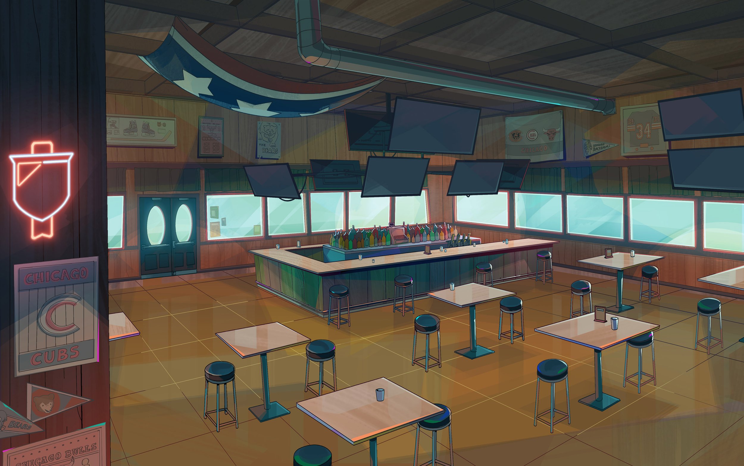
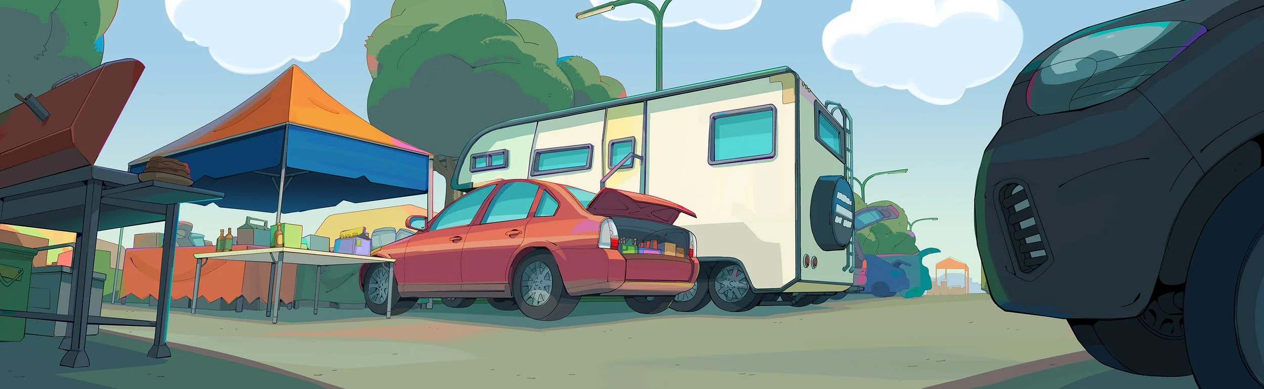
Backgrounds
The backgrounds in CPA aim to be colorful, playful and woozy. We aimed to convey a recognizable version of Chicago while echoing the fun and slightly woozy attitude of our main character, Diane.


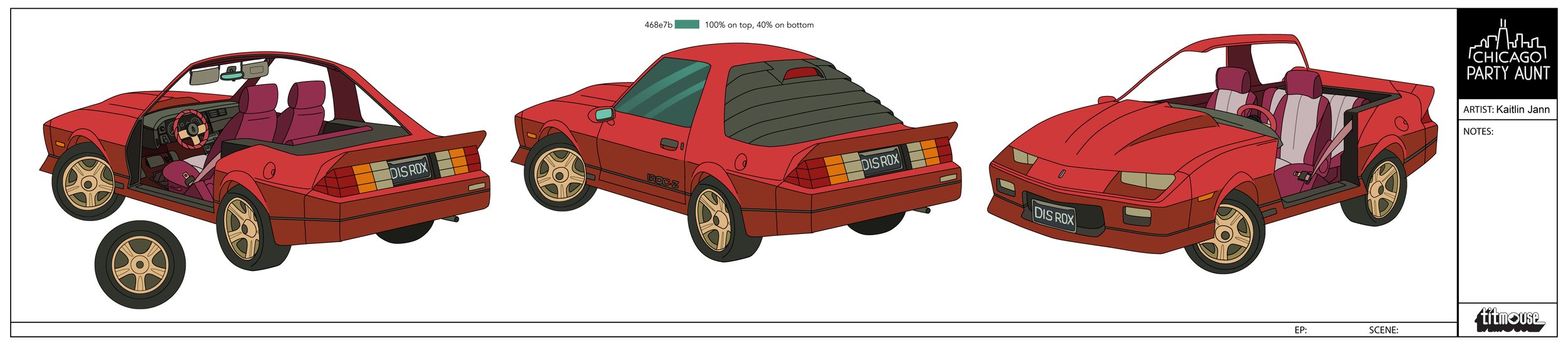
Props & EFX
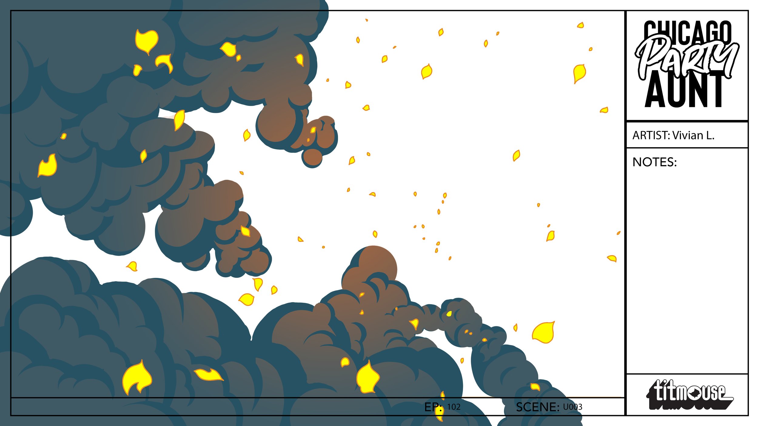
Props and efx on CPA aimed to bridge the visual languages of our simplified characters and our colorful world. Ideally, a CPA prop or effect has vibrant color and rounded, geometric forms that carry though both the character and BG design.


Some of my work on the show
A selection of the some of things from the show that I either painted, designed, or both.


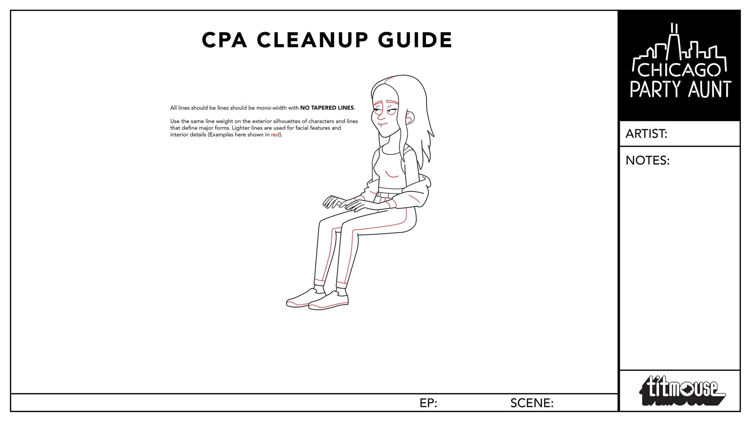
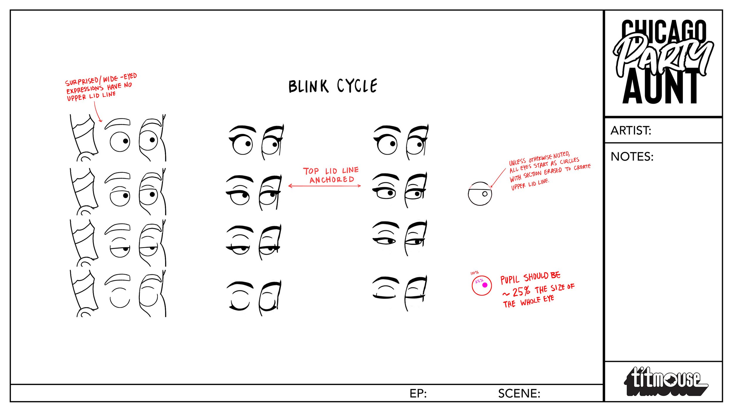
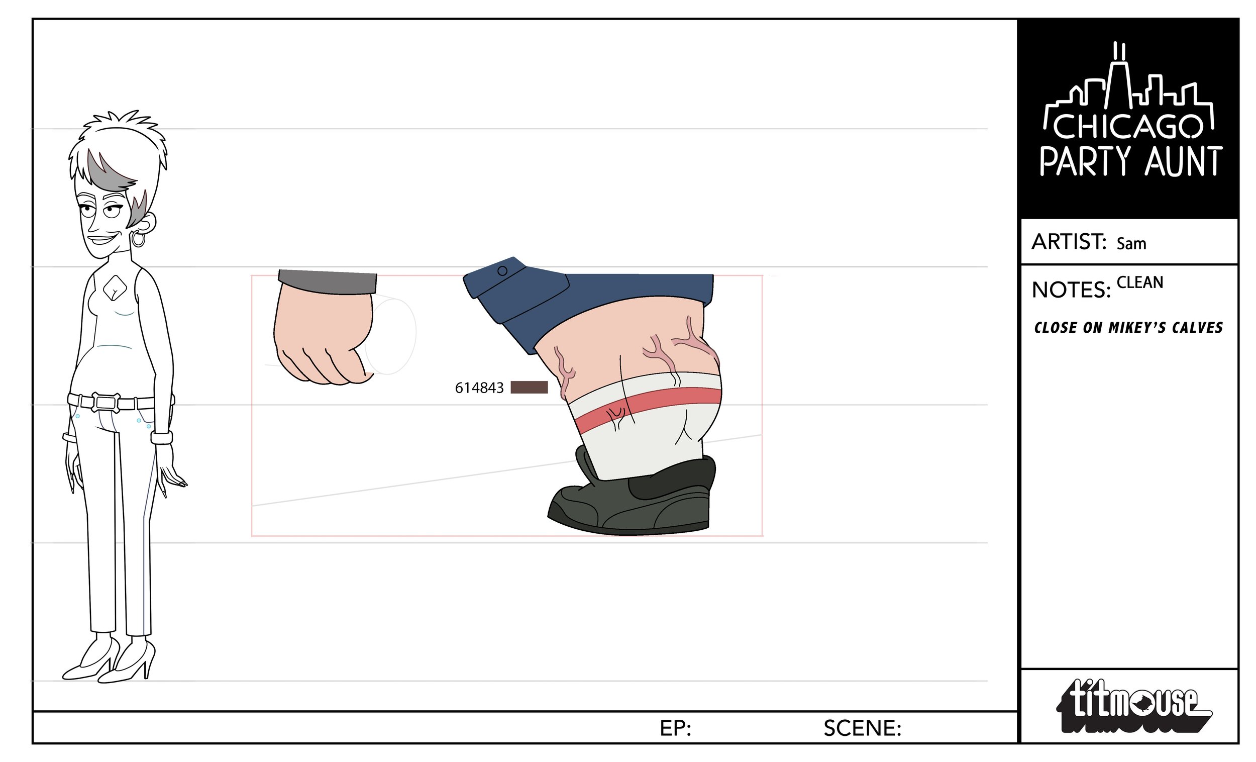
Guides & Misc
Some examples of supporting material made for CPA.